Next case study
4 month contract
I joined the project as a contract product designer late in development, with the signing experience already about 80% built. My role was to identify and prioritize the most critical friction points in the flow and improve clarity without restructuring a system that was close to release.
The signing flow needed clearer steps, status visibility, and guidance to help users complete contracts confidently.
Reduce contract setup errors
Clarify contract signing status
Build user confidence while signing
By introducing onboarding, clearer sequencing, and contextual prompts, I shifted the signing experience from reactive error handling to proactive guidance. The redesigned flow reduced signing errors by 15%, allowing users to sign their contracts more smoothly.
15% error reduction
New onboarding
Step guidance
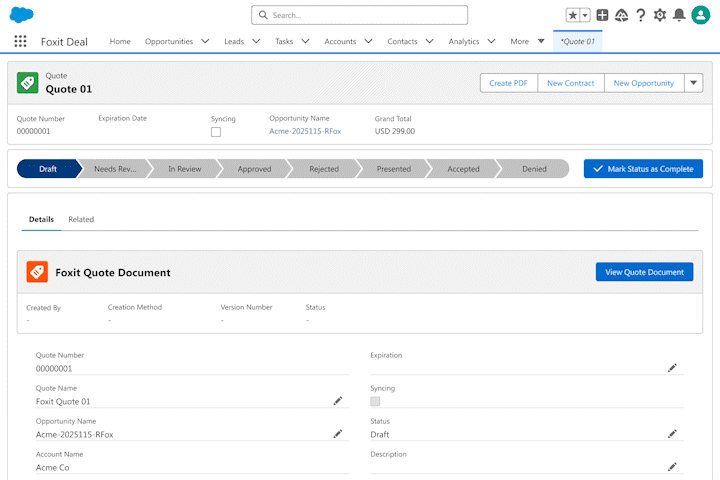
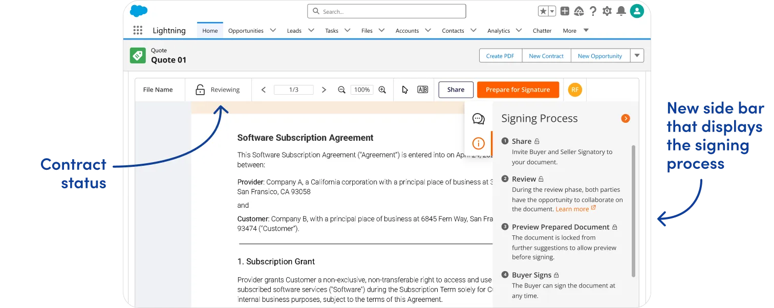
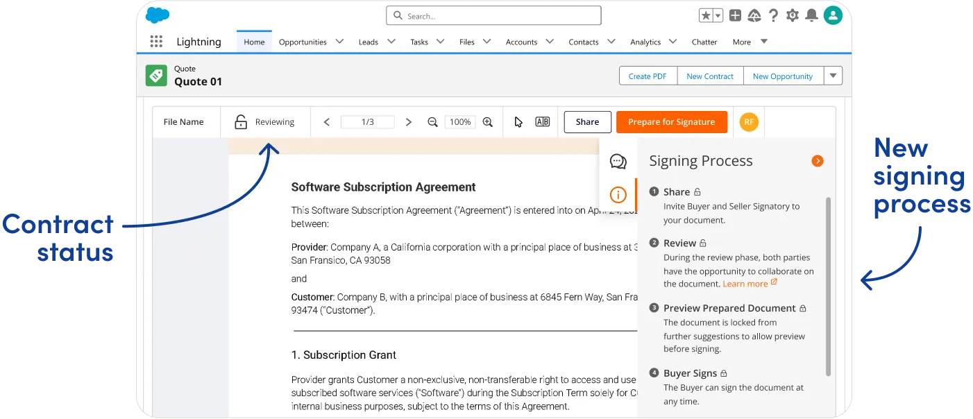
With the app, sales teams could negotiate and sign contracts entirely within Salesforce, eliminating the need to switch between multiple platforms.
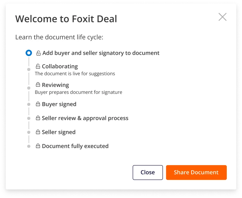
Starting off, I wanted to align the team on a shared understanding of the user’s digital signing journey to make the most of our limited time. The workshops I led helped us define the responsibilities of different user roles at specific steps in the signing process.
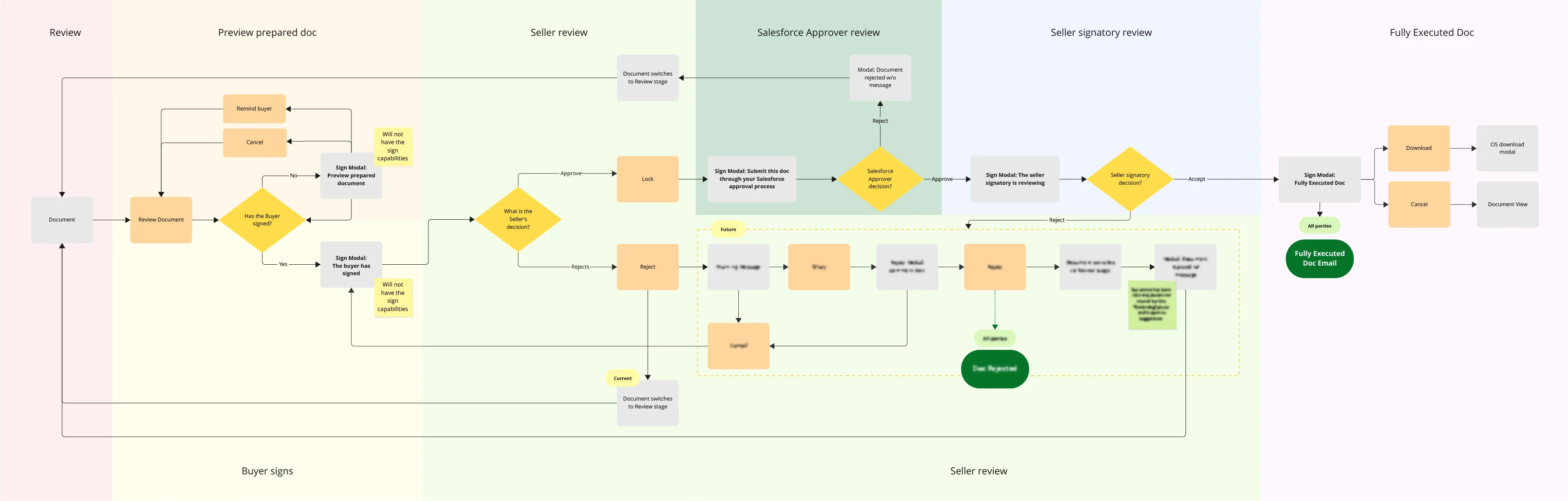
Contracts have signatory parties, such as the Seller (typically the sales team) and the Buyer. Once the Buyer signs, the Seller’s party needs to review, approve, and sign the deal through their company’s approval process.
Our product splits out the Seller’s party responsibility into 3 user roles. What I found in future testing is that the Salesforce Approver and Seller Signatory roles were to source of confusion for Sellers.


I discovered the product didn’t provide Sellers with adequate guidance during signing. Since Sellers facilitate the entire contract process, this gap was blocking their ability to move deals forward.
Sellers landed in the app with no guidance on how to start negotiating and signing.
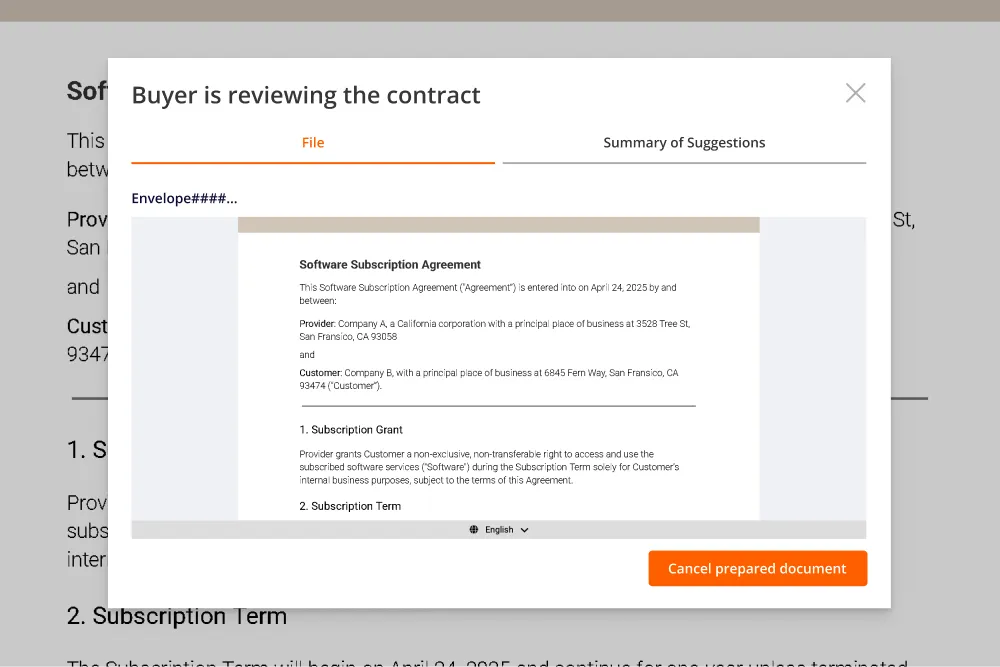
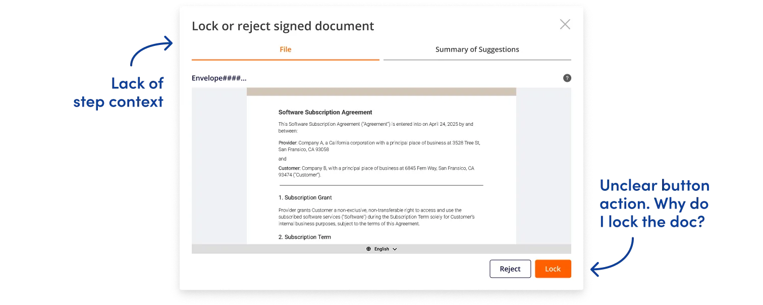
Sellers & Buyers kept triggering the error message to add a Seller Signatory before they could sign.
Sellers waiting for the Buyer to sign had no inkling of the upcoming Salesforce Approval process.
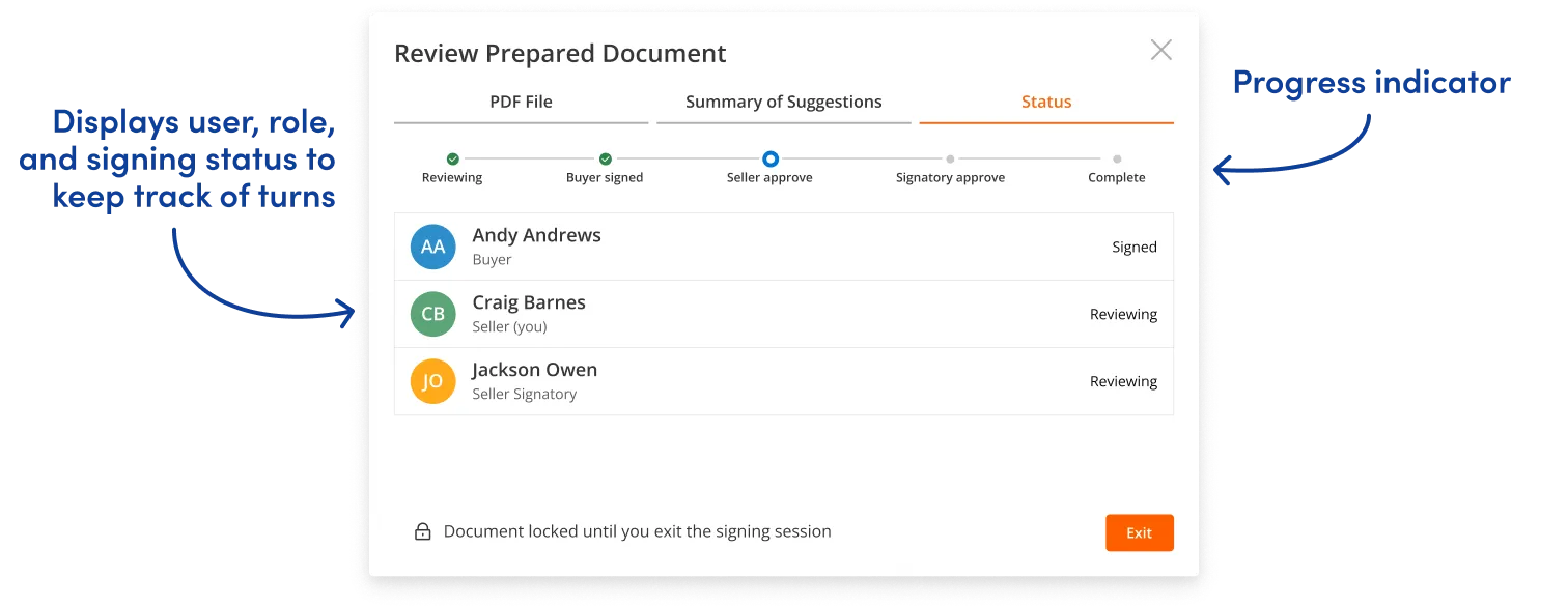
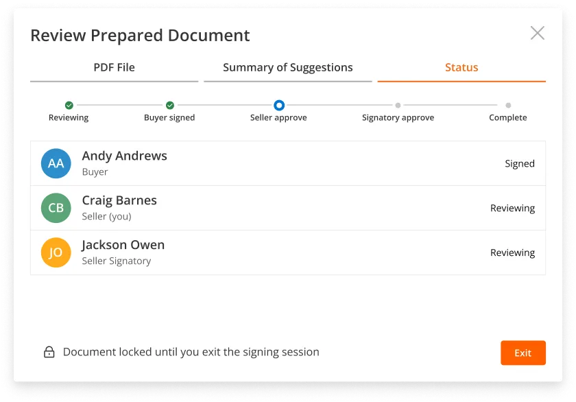
Without clear visibility into roles and the signing order, Sellers were navigating blind through a multi-step process. My challenge was to provide wayfinding that showed users where they were, what they needed to do, and what was coming next.
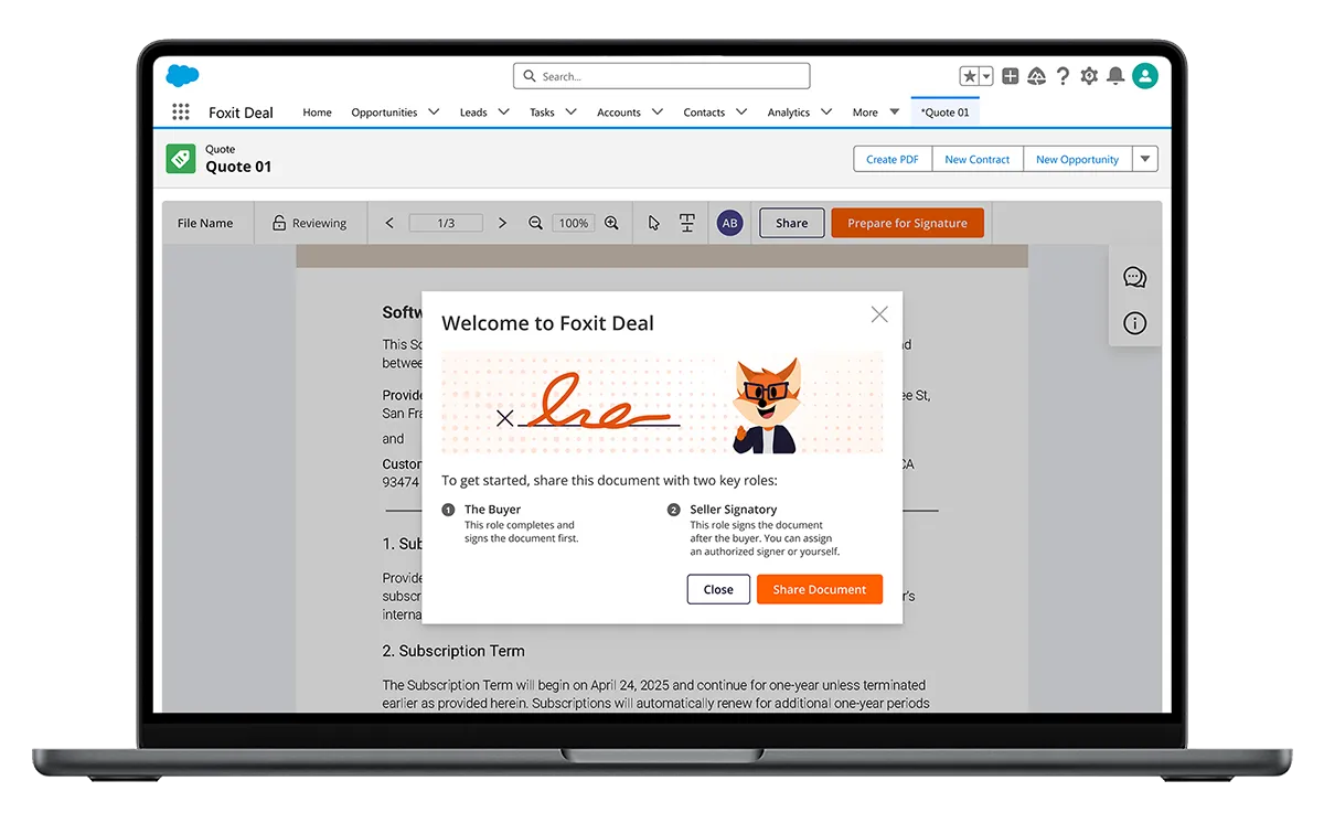
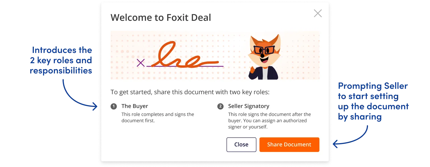
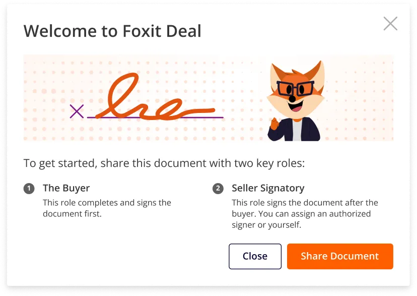
Error messages were Sellers’ first introduction to the Seller Signatory role, creating confusion about why this separate role was necessary. The root issue: the Seller who sets up the contract isn’t always authorized to sign it. I wanted to explore the best way to prompt and educate our Sellers of the required roles.

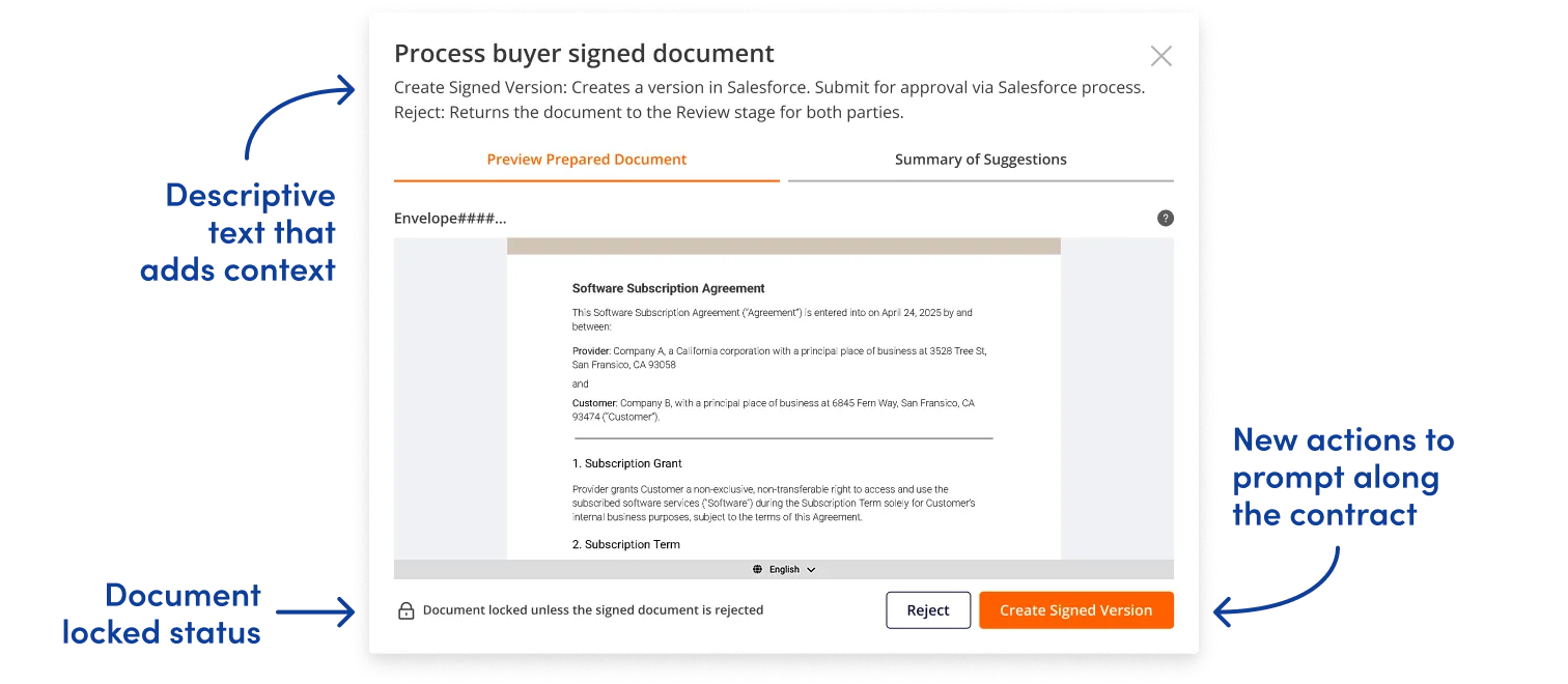
By introducing an onboarding prompt that explained required roles before setup began, I could eliminate the trial-and-error frustration and help Sellers configure contracts correctly on the first attempt.
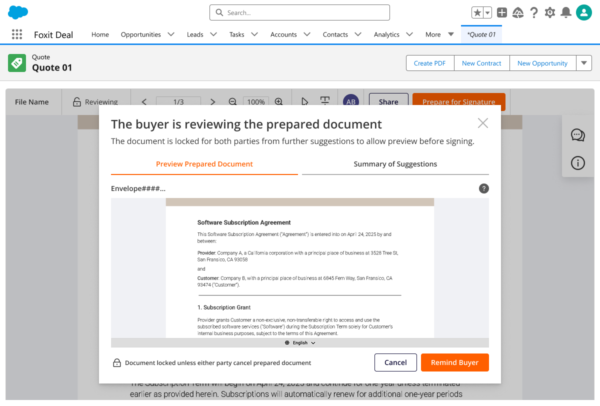
Sellers felt blindsided by unexpected signing steps, such as the Salesforce approval process (often stalled out here). I advocated for clearly defining the signing process steps and making them visible to users, an approach that the Product Manager agreed would eliminate the confusion.
However, the engineering team lacked the time to implement dynamic step-tracking for user roles, so the Product Manager asked for alternative solutions we could pursue in the interim.
Sellers told us they hesitated before taking action, worried about selecting the wrong option. I wanted to transform the signing modal from a simple action button into an educational moment.
By adding step-specific context that explained what signing or approving actually meant, I eliminated the guesswork. Users could now act with confidence, knowing exactly what their role required at each stage.
In just four months, I transformed a disjointed pre-launch product into a launch-ready signing experience. According to the team, these changes contributed to a 15% reduction in signing errors during final development.
Working as the sole designer on a contract meant I couldn’t stay to see the product next steps or validate improvements through testing (a limitation I felt keenly.)
My next steps would have been to run another usability test to compare the total completion time, completion rate, and error rates. These metrics would help me identify if the redesigns were helping users intuitively move through the signing process. By signing contracts faster, Foxit Deal’s promise of closing more deals for their customers would ring true.
My systematic approach left the team with more than just redesigned screens. The team gained:
An impactful design system that provided a shared language across all users to rapidly align on signing steps.
A comprehensive product flow with documentation that eliminated ambiguity for developers.
A streamlined product roadmap that enabled clear prioritization of immediate and long term needs.
Creating conversation pieces. My favorite part of the project was the digital signing workshop, where we explored the entire signing flow from each user’s point of view. By collaborating on every user question and action, the team and I built a shared understanding for our users. It garnered team excitement and led to a product roadmap that helped feature prioritization.